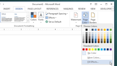
Productivity apps ensure that they are distraction free and that the interface they offer makes it easier for the average person to concentrate. Some of the best apps do this exceptionally well but what many will often neglect is make sure an interface doesn’t strain a user’s eyes. Very few apps are built with both light and dark themes making them easy to use in a well lit room but are practically a strain to use at night. Microsoft’s Office suite of apps was no different up until the 2016 version which comes with a built-in dark grey theme that you can apply to all apps in one stroke. Here’s how.
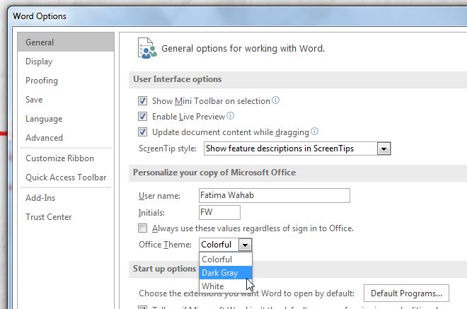
Open any Office app of your choice and go to File>Options. In the General tab, scroll down to the ‘Personalize your copy of Microsoft Office’. There’s a new ‘Office Theme’ dropdown that features three options; Colorful, Dark Grey, and White. Pick Dark Grey and the theme will be applied across all apps.
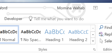
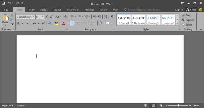
Here’s what Word 2016 looks like with the Dark Grey theme and I may never go back to the default ‘Colorful’ theme.
Choosing the ‘White’ theme will turn everything White. The title bar, which is normally blue in the Colorful theme for Word and a dark grey for all apps in the Dark Grey theme, will turn white. It’s easily the brightest theme.
At present, you’re restricted to the themes MS Office 2016 comes packed with and you can’t choose to change the theme for just one or two apps. The dark grey theme is without a doubt much easier to use if you’re working on a large document, spreadsheet, or presentation.

